Project overview
This project sought to redesign an existing website to promote the International Day of People with Disability (IDPwD), December 3rd, to the Australian public while making it easier and more fun to plan and run celebration events.
Our goals
Communicating a shift of focus from the Disability Award to celebrating the day widely in workplaces and communities
Providing resources and inspiration for members of the public to run their events
Creating a fresh, engaging and useful digital platform that people visit before, during and after event celebrations
Our team
For this project, I got to provide user research insights to a close-knitted team of driven and open-minded individuals. Our team consisted of a Graphic Designer, a Drupal Developer, a Project Manager, a Communications and Media representative, and members from our client area.
I contributed by
- developing a working prototype for testing / Axure
- designing a validation survey / Survey Monkey
- synthesising and presenting feedback / PowerPoint
What we did
- Start with what worked well with our audience
Through internal meetings with representatives from our client area, our Senior Graphic Designer and I confirmed that the IDPwD website was targeting the same audience groups as Harmony Day:
- communities
- schools
- sporting organisations
- workplaces
- government agencies
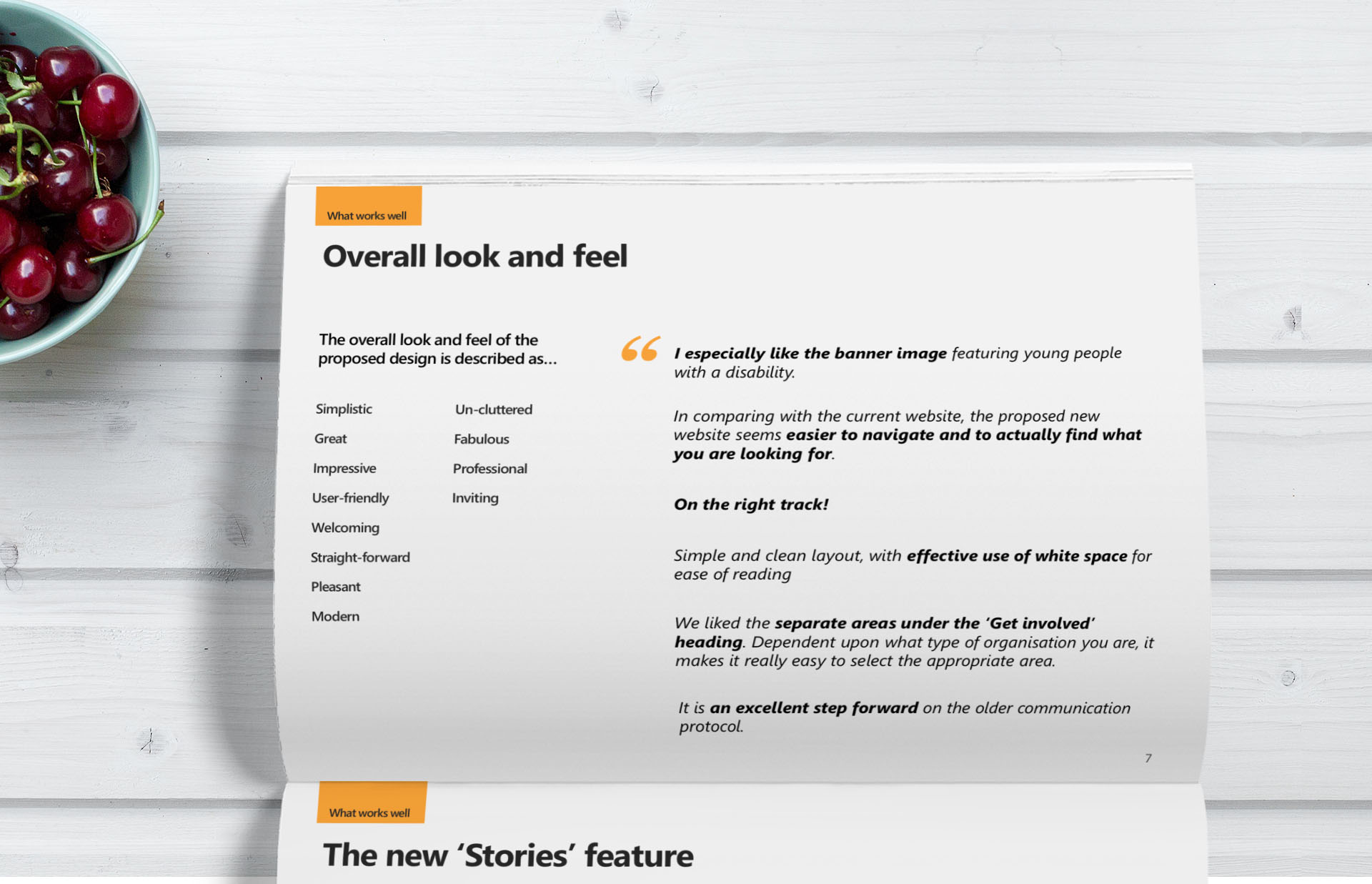
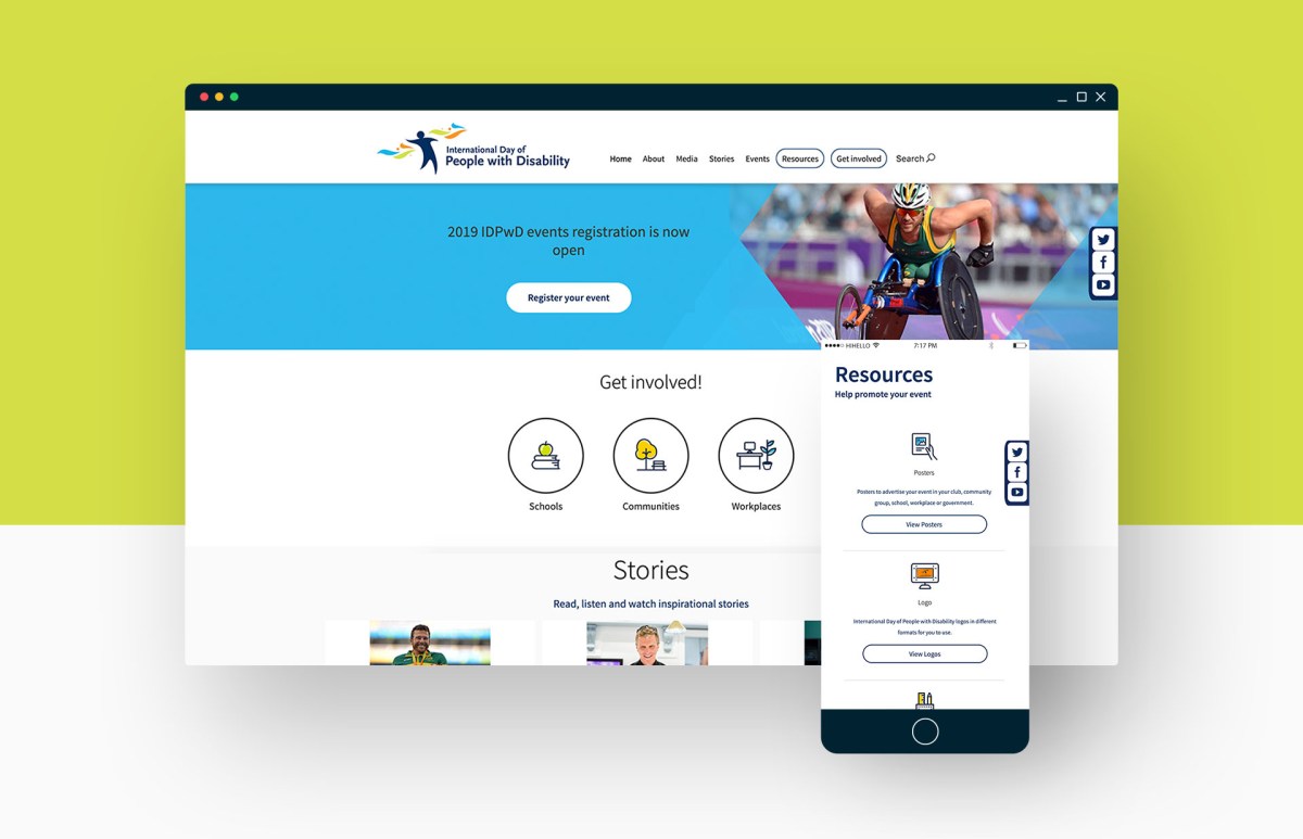
In light of Harmony Day’s success as a digital product, we decided to base the initial prototype and navigation structure of the new IDPwD website on what had worked well for the Harmony Day website. I then set out to design a validation exercise before engaging with a diverse sample of target users.
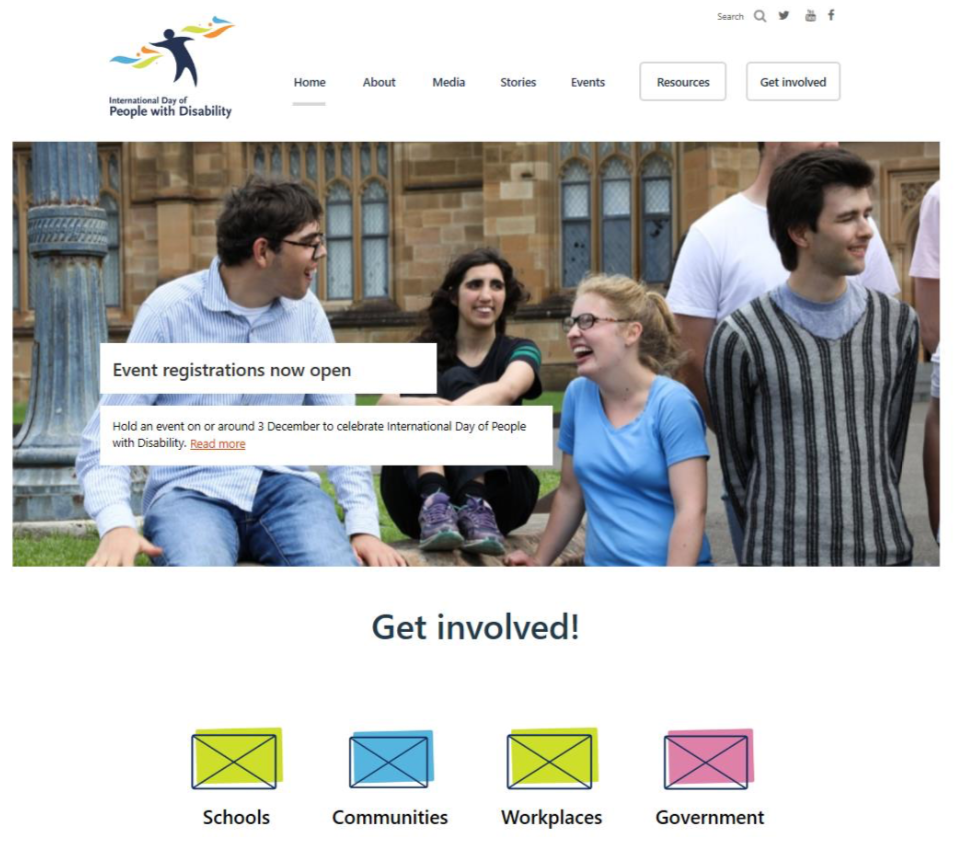
Figure 1. Initial hi-fi prototype for validation with end users
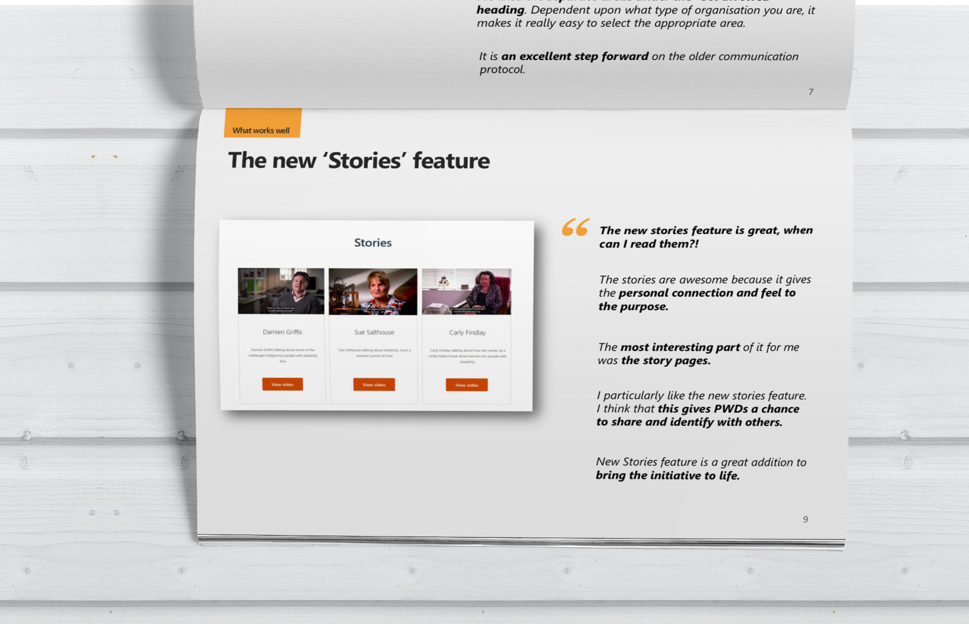
I then designed and conducted a validation exercise with an informed and diverse sample. After synthesising the feedback received, we soon identified two key ways to amplify the day and build more awareness: introduce real-life stories. We added a section to let visitors read, listen and watch inspiration stories from advocates, influencers, and community members.
We also learned that people loved the new refreshing and vibrant look and feel and the photos used.
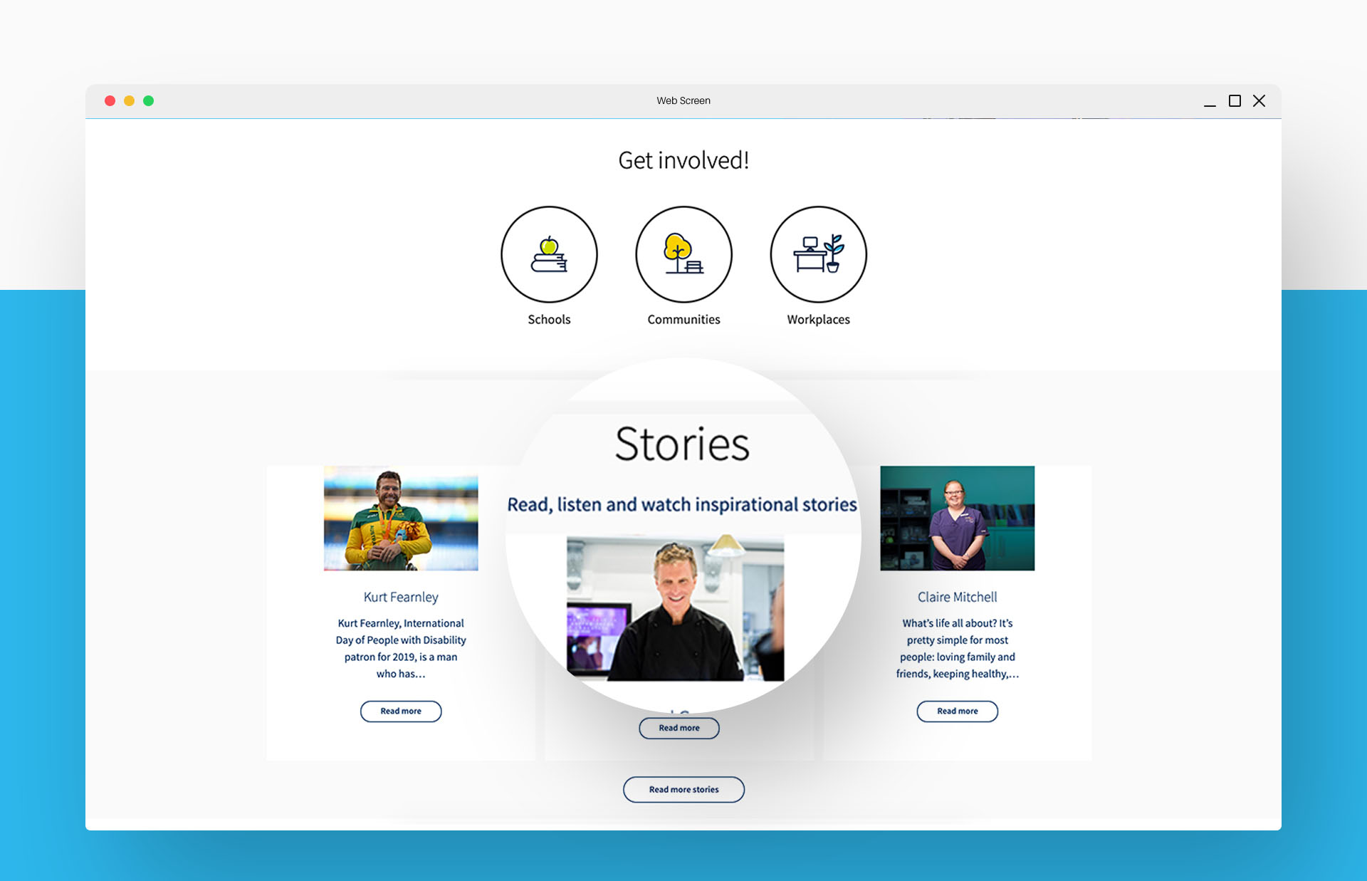
Figure 2. The Team added a section to let visitors read, listen and watch inspiration stories from advocates, influencers, and community members
The results
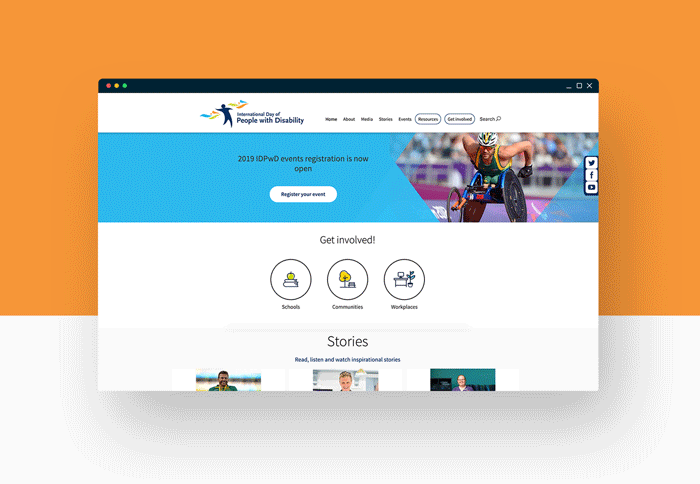
Figure 3. Final home page design for development
The new design looks fabulous – well done. Drop down boxes flow well, nice font style and size. Lots of white space which dissolves that busy, confusing style seen on many sites. Great photos and fabulous touch with the story videos. 10/10 in my book.
A current IDPwD website subscriber,
Validation research – May 2018