At a glance
Problem statement
The Carer Gateway website had poor navigation, outdated design, and insufficient accessibility, hindering carers’ ability to find and access crucial information and support.
Key hypothesis
Redesigning the Carer Gateway website with a more intuitive navigation structure will reduce the average time carers spend searching for information
Target users
Anyone who’s looking after someone with disability, mental illness, dementia, a long-term health condition, an illness that will cause their death, or an alcohol or drug problem, or someone who is frail because they are old.
Scope of engagement
43 carers through 2 Alpha rounds (22 carers) and 21 Beta testing sessions
My role
UX Research Lead from Alpha, to Beta and Launch.
Methods
Surveys, Interviews, Usability Testing, Workshops, Meetings
Impact
The redesigned Carer Gateway website resulted in improved navigation, a modern and engaging design, and enhanced accessibility. This led to a significant increase in user satisfaction and engagement, enabling carers to more easily access essential information and support services.
Impacts for teams
Product
More confidence when defining and prioritising features that would deliver the most value to carers, based on user research and feedback.
Marketing
Developed and executed a targeted launch strategy featuring the “You’re Not Alone” messaging to resonate with carers.
Content
Could focus on restructuring the information architecture to improve content discoverability and usability.
Project details
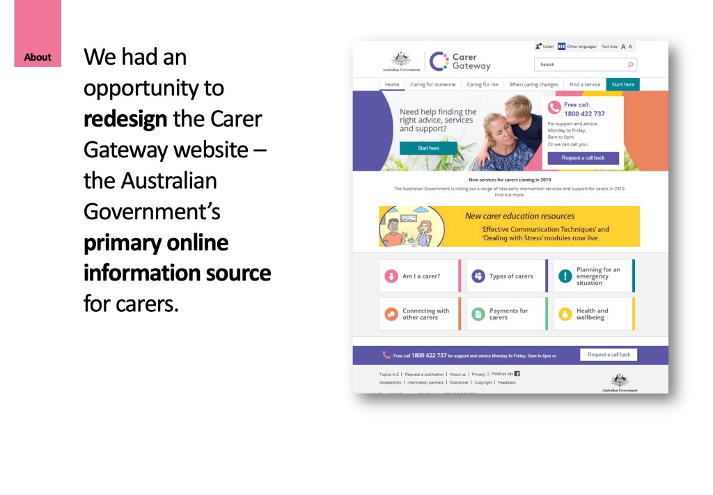
Carer Gateway is an Australian Government initiative. Since mid-2018, Carer Gateway has been making some changes to better help Australians who are caring for friends or loved ones to access practical advice, information and support.
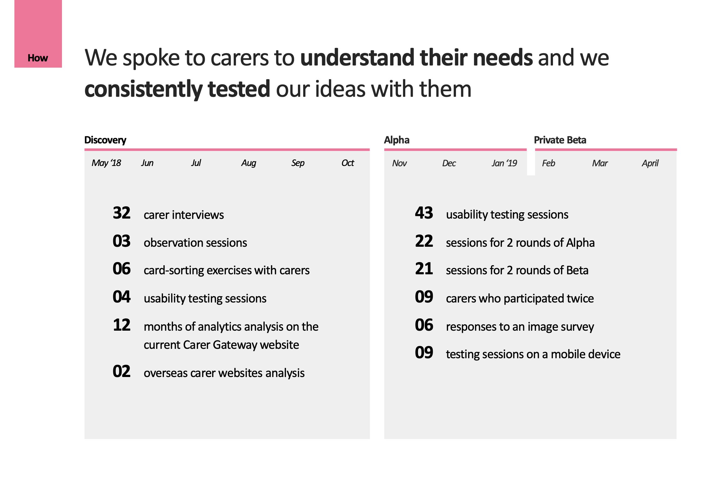
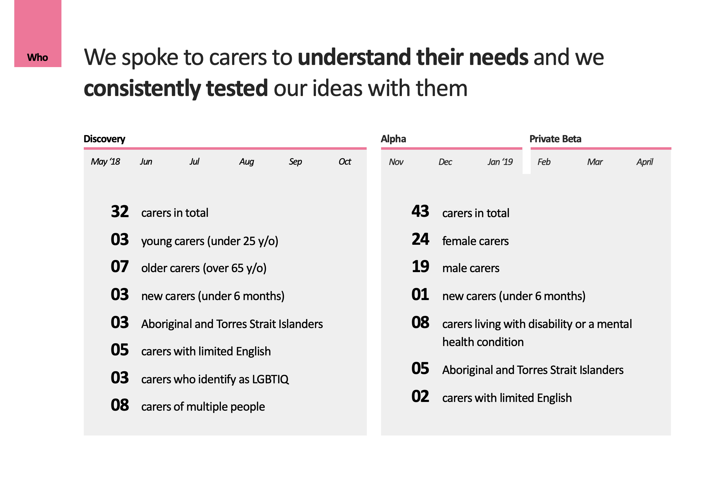
Discovery research informed by in-depth interviews and comparative analysis
At the beginning of the project, our partner agency, Apis Group, interviewed 32 carers, and conducted card-sorting as well as usability testing of the original website. They also looked at overseas carer websites for what worked, on top of analysing the original website’s analytics.
Starting Alpha phase with strong content direction
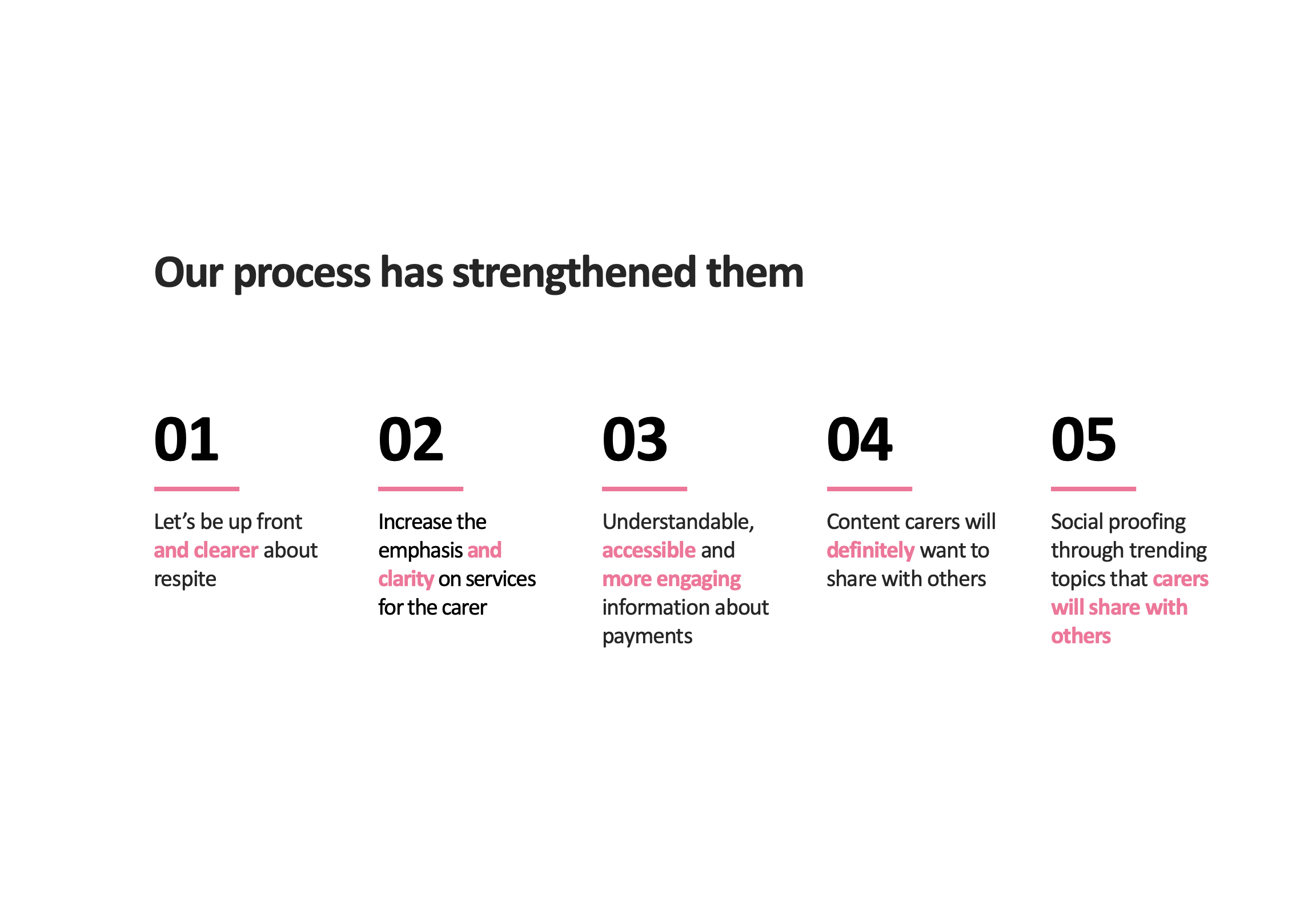
I started research for the Alpha phase with five resulted principles:
- Be up front about respite
- Increase the emphasis on services for the carer
- Understandable information about payments
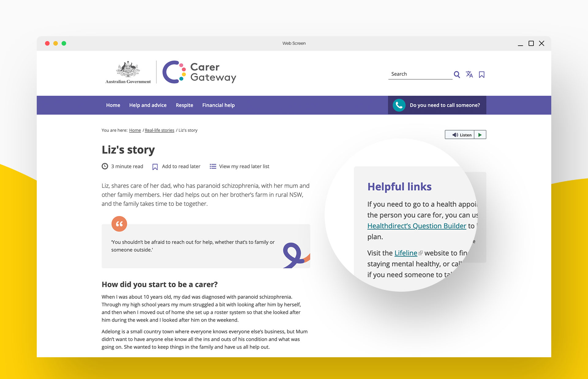
- Content that carers will want to share with others
- Social proofing through trending topics
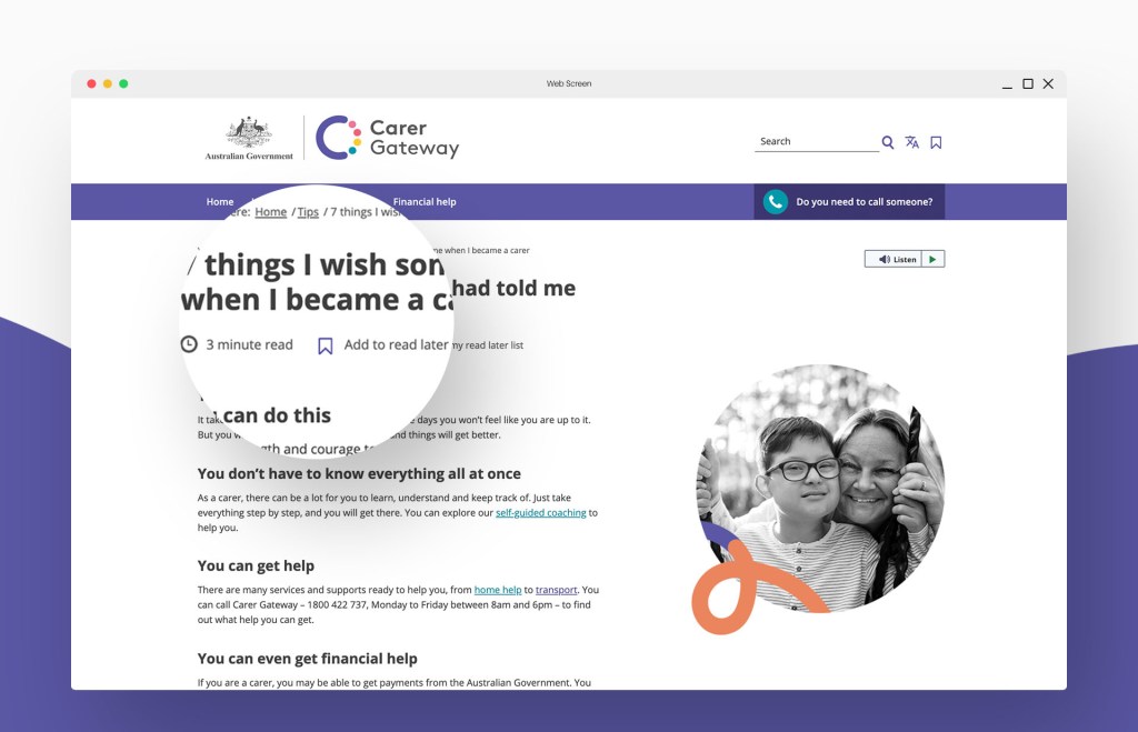
My team used these principles to redesign the site and rewrite content before multiple rounds of testing with real carers, staying close to what’s at the heart of our content strategy:
Be short. Be simple. Be human.
Sir Ernest Gowers, Plain Words: A Guide to the Use of English
Ask, listen, respond early and often
The best way to ensure a wholistic understanding and to build a great solution was to involve end users from diverse backgrounds throughout the design process.
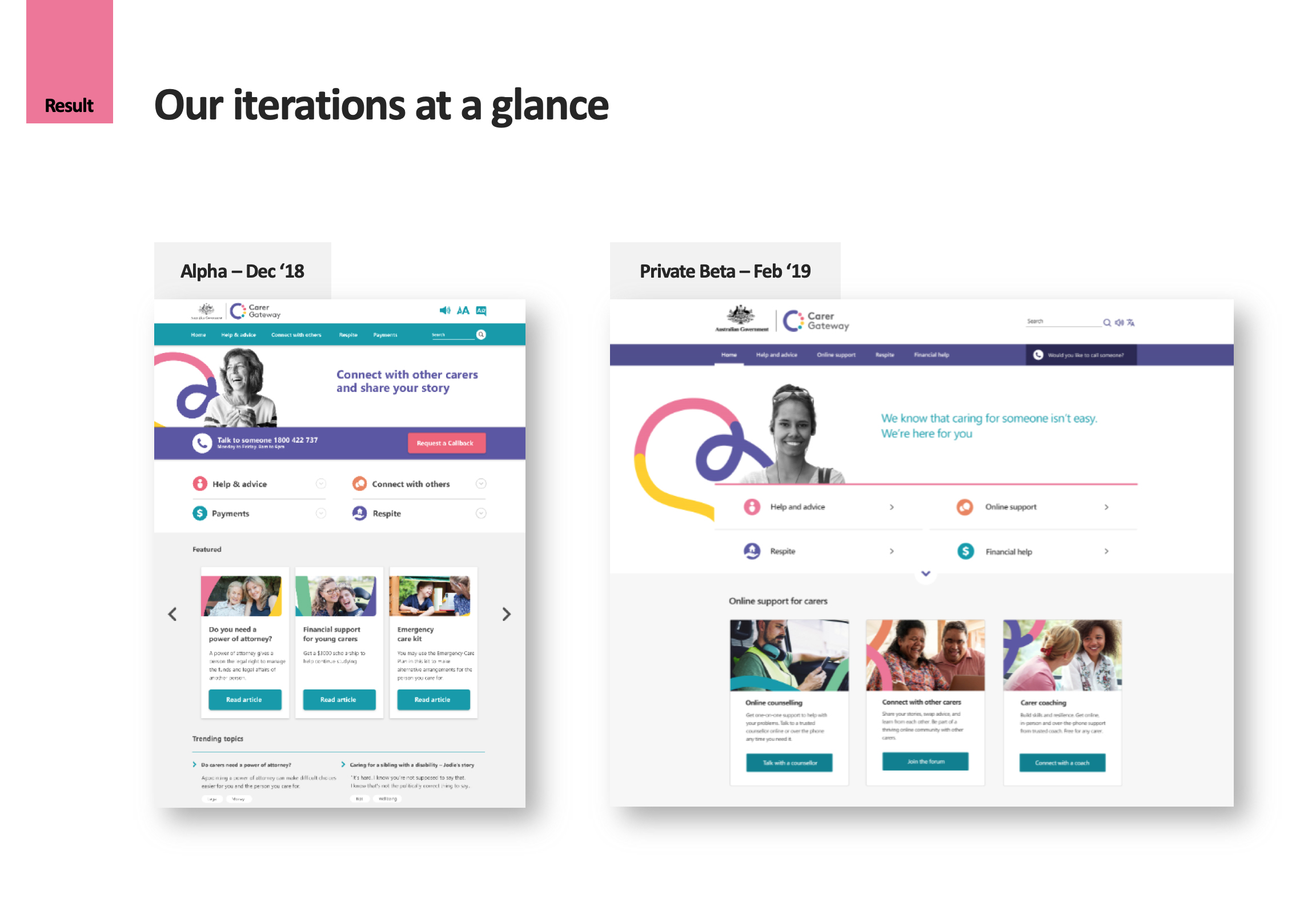
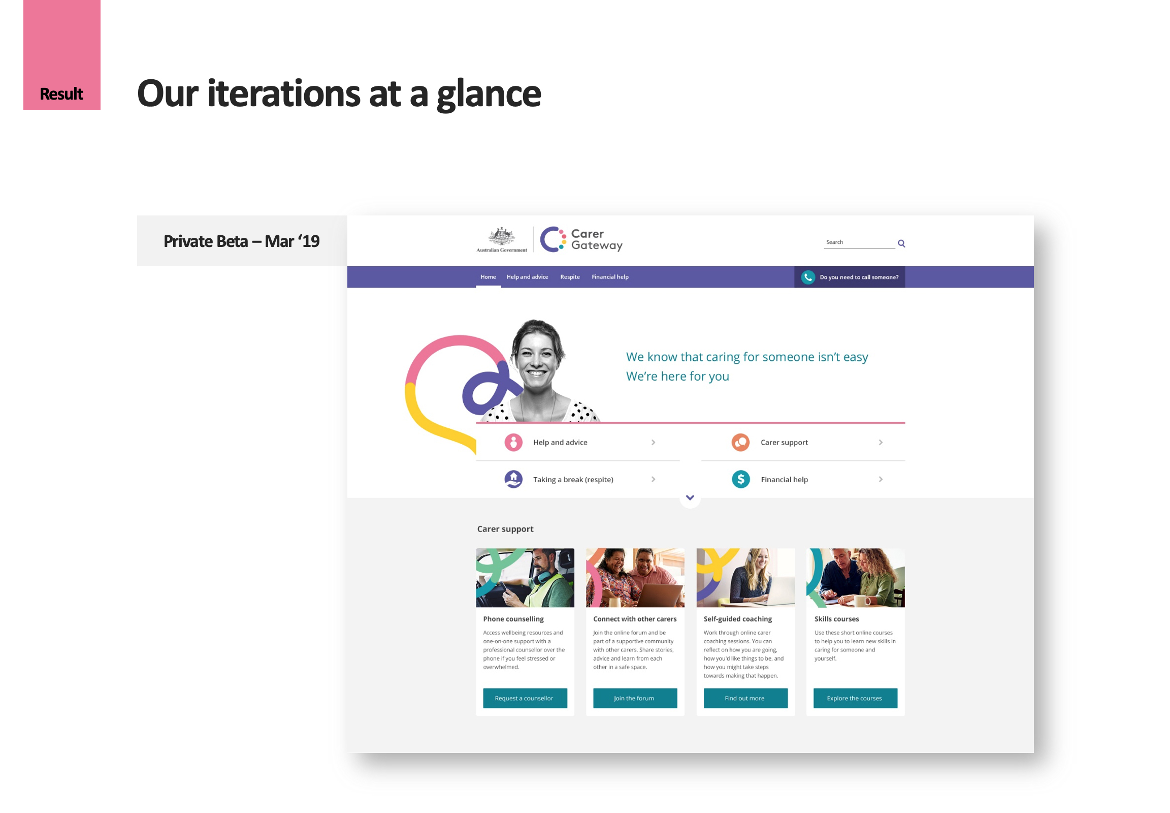
I engaged with carers to hear their stories and to understand their needs. Prior to our public launch on July 1, we conducted 2 Alpha rounds of testing with 22 carers before my team made changes based on their feedback. This was then followed by 21 more sessions for Beta.
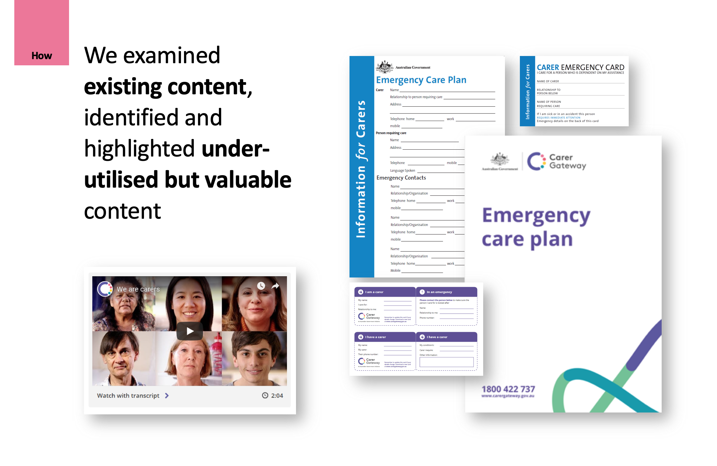
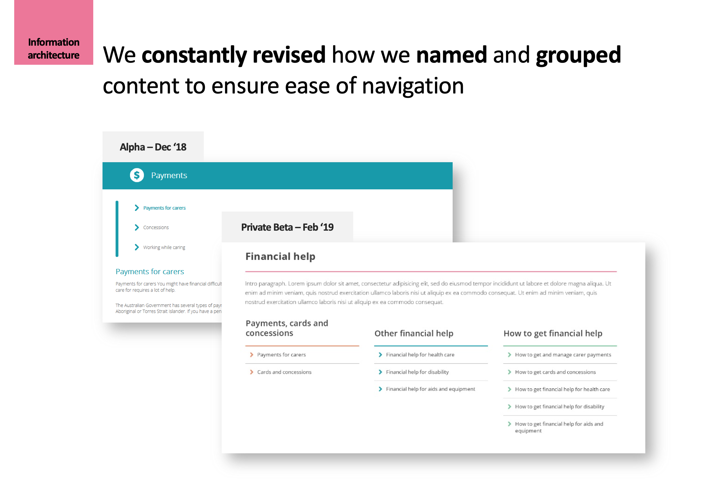
Re-evaluating existing content for value
In redesigning an existing product, we don’t start from scratch. We often have existing content at our disposal, which we can deprioritise or promote.
Hypothesis 1
The existing videos of carer stories are interesting and valuable to carers.
How we tested it
I invited carers to take their time interacting with our HTML prototype as if they were by themselves. I requested they say out loud any comments or wonderings during the process.
What we found
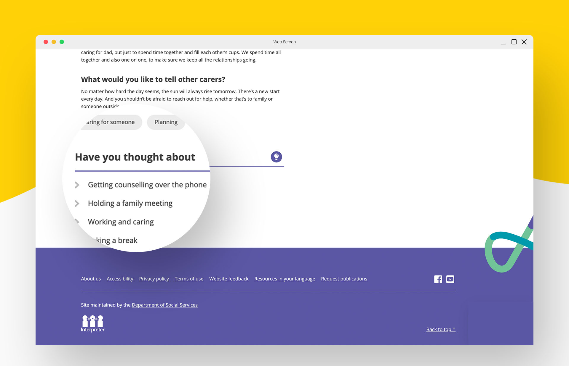
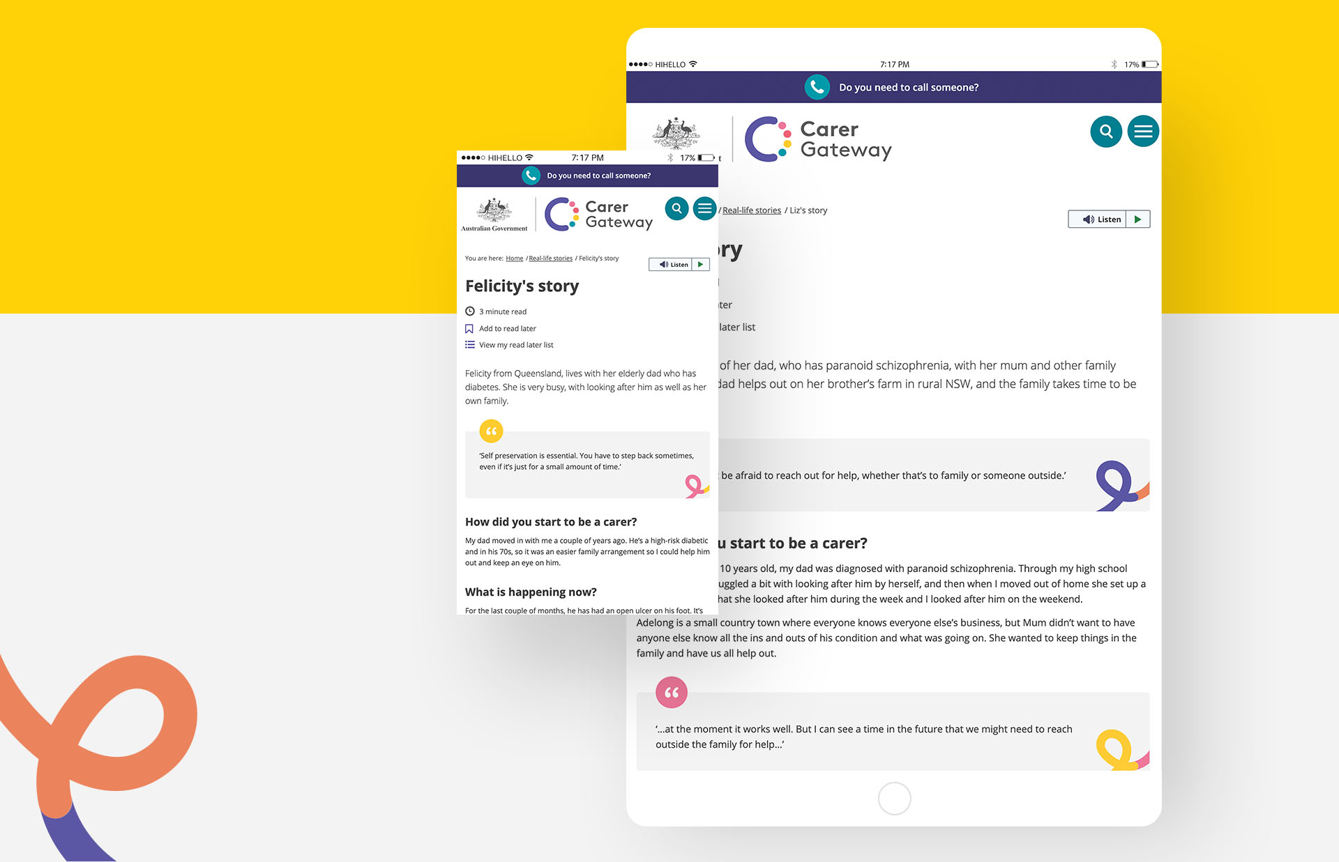
When looking at our clickable prototype, most participants paused to view the carer story video on the home page. My team witnessed very positive reactions towards the We are carers video as carers reported feeling like they were not alone after watching it.
Hypothesis 2
There is a need for an Emergency Care Plan and Carer Card among carers.
How we tested it
I asked each carer to describe what emergency meant to them. Then I followed up with asking what they would do in an emergency.
What we found
Most people spoke about situations where the care-recipient was at risk. No one thought about scenarios when something happened to them. While a few participants indicated having written things down on documents in case of an emergency, most people simply weren’t sure of what to do.
Hypothesis 3
The existing Emergency Care Plan and Carer Card are useful for carers.
How we tested it
After listening to how each career perceived emergency, I described key parts of the existing Emergency Care Plan and Carer Card to participants, and asked for their thoughts. I also asked what formats they would need the resources to be in.
What we found
Almost all carers found both resources useful, and expected to be able to have them both in an electronic fillable format and a printable version for offline use. They said they would email or give copies to trusted individuals: teachers, family doctors, lawyers, friends and relatives.
Actions we took
- As a result, my team went ahead with keeping the We are carers video on the home page. We further promoted the existing videos as part of a growing collection of stories, along with more carer interviews.
- Information on planning for an emergency was also added as one of the popular pages on the home page.
- A new and improved Emergency Care Plan was referenced where relevant throughout the website.
Outcome highlights
Ease of navigation through multiple rounds of scenario testing
A personalised experience through conversational content elements
More support for time-poor carers with curated relevant links
“You are not alone” through a scalable content and design strategy
Assurance for no dead-end’s with the nitty gritty
The results
The new Carer Gateway website is the combined efforts of many people from different disciplines, from web design and development to user testing, from content writing to project management, from policy to web publishing and accessibility.
For more than a year, we have continuously asked, listened, responded, and seen the design grow into what brings value to Australian carers.
I have loved hearing all the carer stories, and carer voices have really driven this project. It’s been really rewarding to see the site grow and improve each time we made changes.
Team member, Department of Social Services

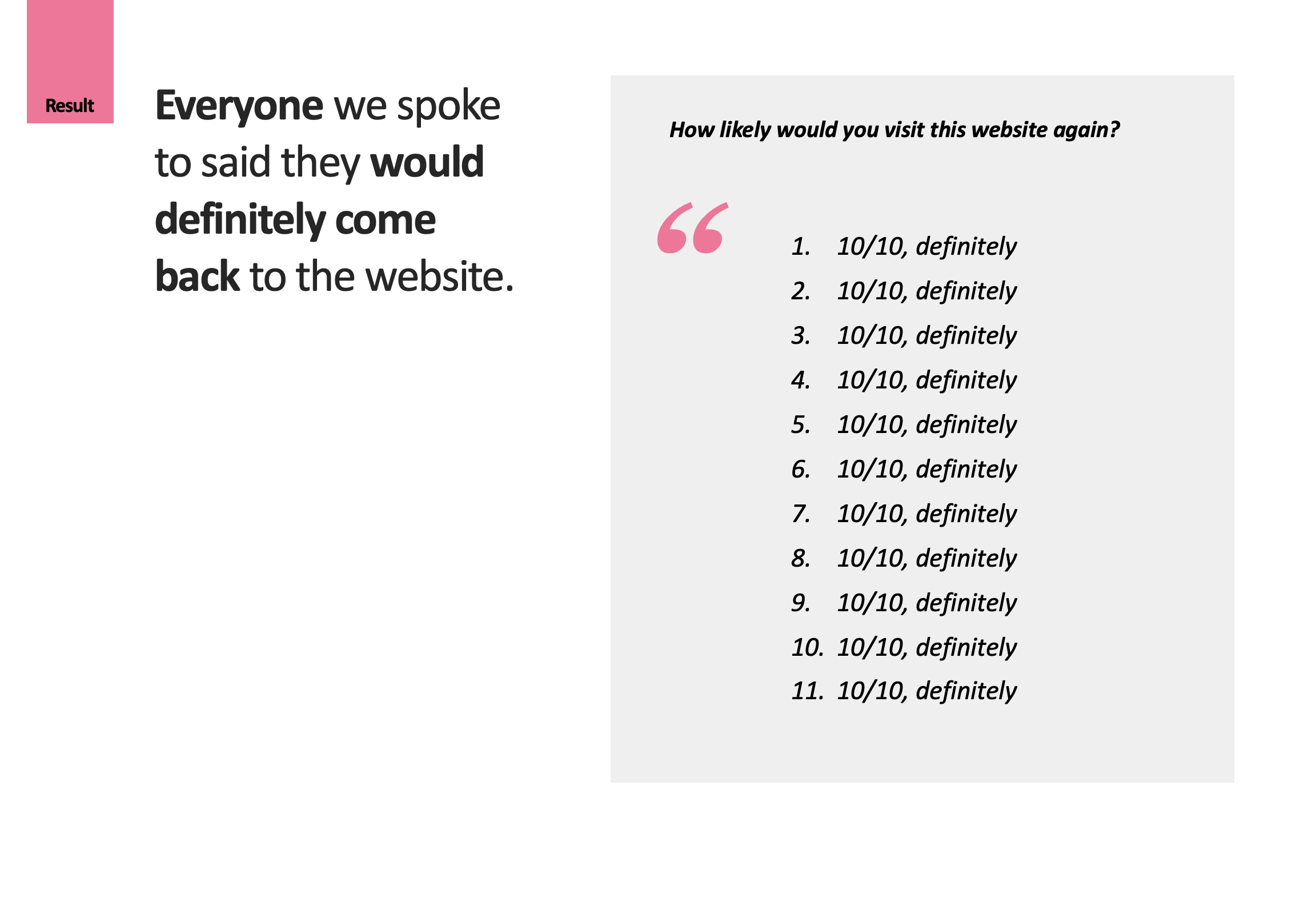
“10/10, I’d definitely come back to the website”
In a confirmative testing round leading up to the site going public, we gathered remarkable evidence that the hard work had paid off: everyone we spoke to said that they would definitely come back to the website.
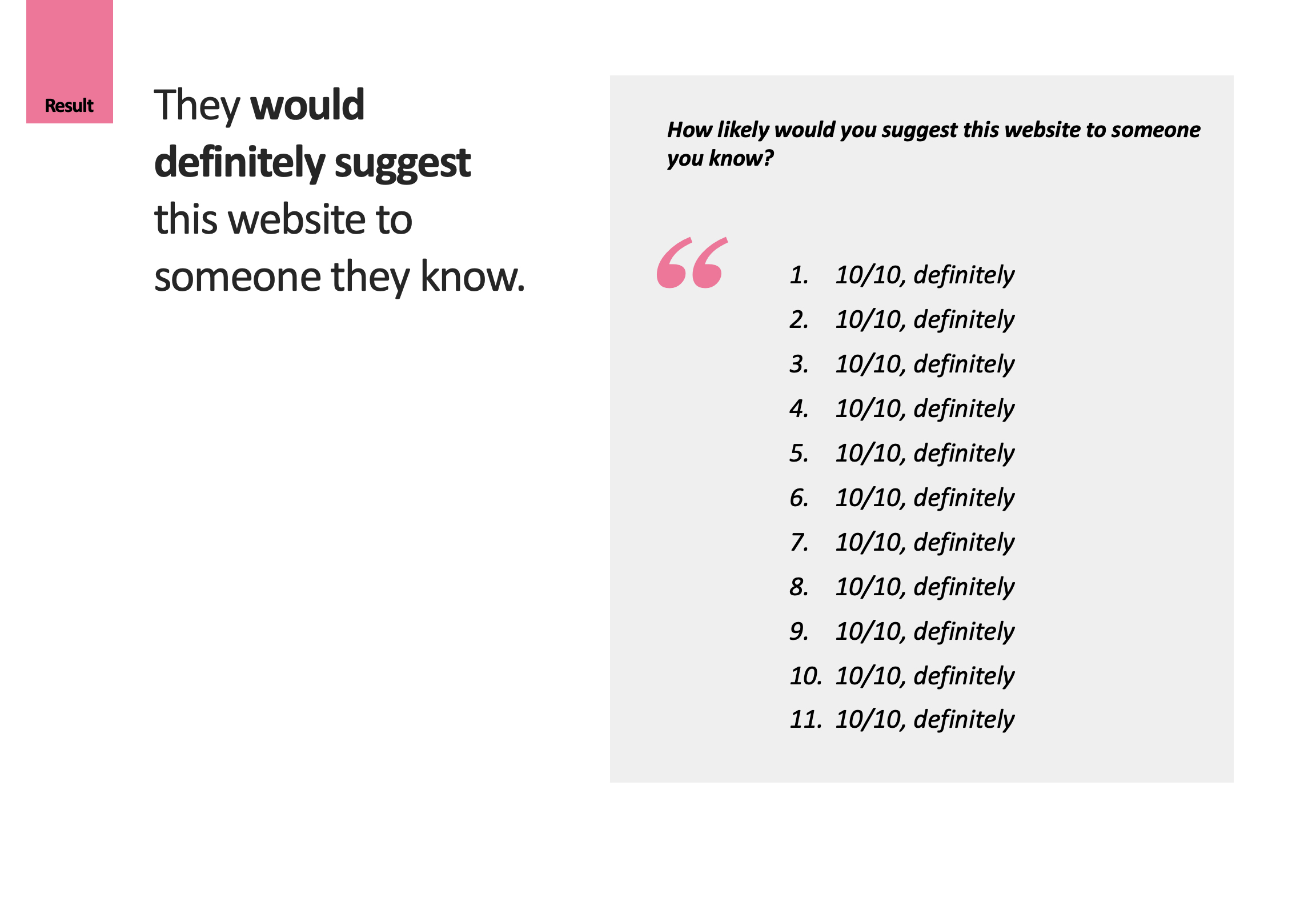
They further expressed absolute willingness to suggest this website to someone they know.
The team is made up of people who all have one thing in common – we have all had the goal to produce the best product possible. I have learned a lot from each person along the way, and am proud to be a part of this team
Team member, Department of Social Services
Recognition & Nominations
Finalist
Australian Web Awards, Government Category, Australian Web Industry Association
Nominated
Australian Government Digital Awards, Digital Transformation Agency
Nominated
Clear Communication Awards, Carolyn Alexander, Joh Kirby and Carol Mackay
Nominated
Public Sector Innovation Awards, The Institute of Public Administration Australia (IPAA)
Nominated
Secretary’s Excellence in Innovation Award, Department of Social Services